Pocket Coach App
for FiTbyPhase
Scope
UI/UX
Design
Illustration
⇧
The experience begins with a dynamic background that pulls its hue gradient based upon the user’s time of day. This would give the app an essential sense of newness with every use and was based upon the insight that a typical user would interact with it multiple times throughout the day for nutrition in addition to exercise.
⇧
Because we wanted Pocket Coach to become a more of a companion than a mere tool, we threaded personality throughout every response the app gives the user. To further engage this feeling of conversation with the app, we structured the UI so that all of Pocket Coaches’ questions and responses write out at the top of the screen, while the users’ interaction remain toward the bottom.
“We came to Mindprizm with a need to improve our app and an idea of how to achieve that. What was and continues to be provided is groundbreaking and innovative design, creativity, and experience exceeding all expectations.
They listened to our problems, our needs, and our dreams and developed a vision and design that fits who we are as a company AND what we want to become.”
-Chad and Maria, FiTbyPhase⇧
We wanted every step in the process to feel as interactive and personal as possible even down to choosing a program goal. These goal illustrations will be upgraded into full-blown walk and idle cycle animations in an upcoming app update.
⇧
Since Phases might be a foreign concept to some new users, we built simple educational interactions into the first-time experience.
⇧
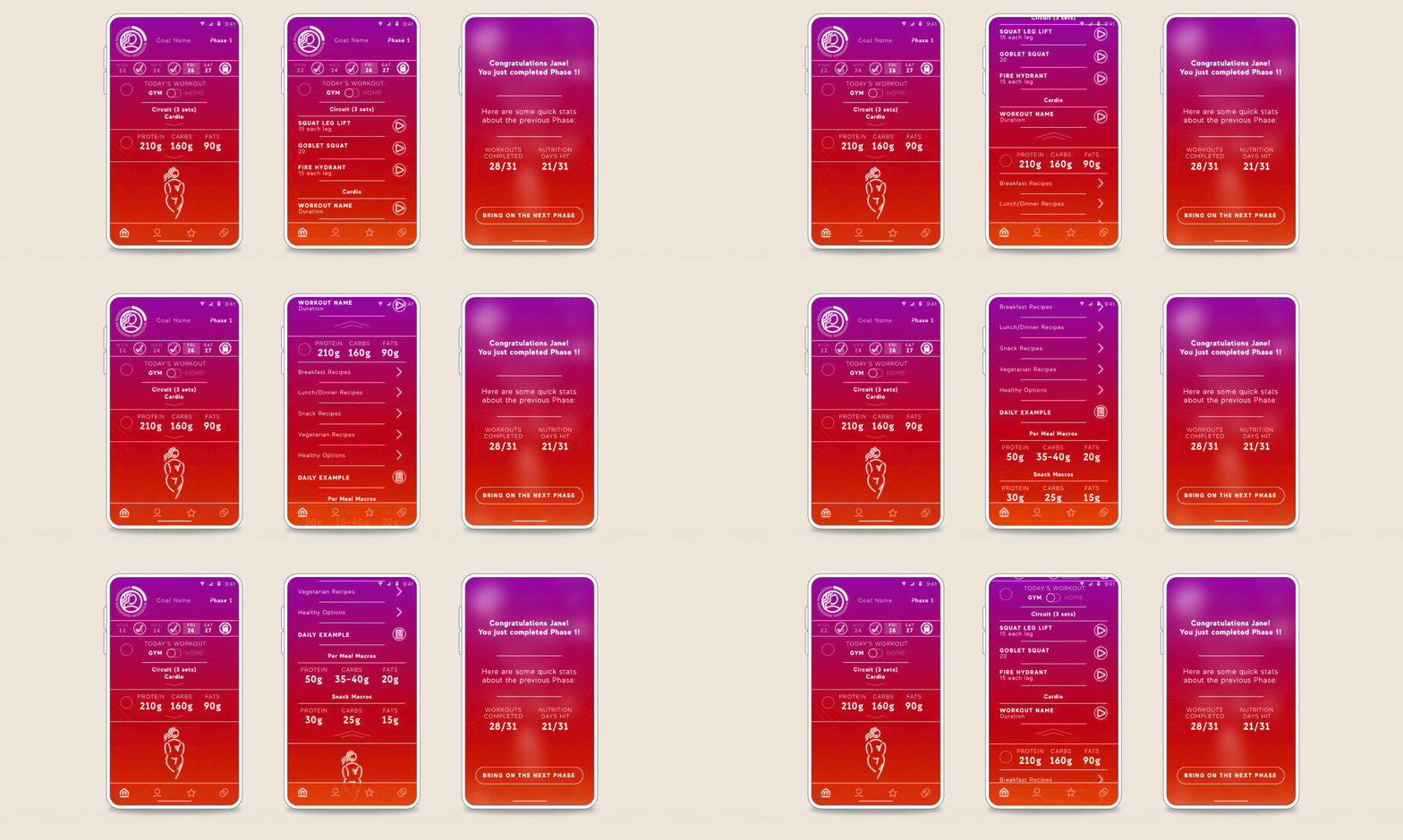
All of these elements come together in the user’s home screen, the single place they’ll be spending the majority of their time. To that end, we made the workspace as flexible as possible through collapsable menus and fly-away subsections allowing the user to easily see the job to be done without the need of scrolling or getting lost in details until they’re ready.


