Startup Forge Branding
They were looking for branding that would be uniquely memorable, yet feel established.
Scope
Design
Illustration
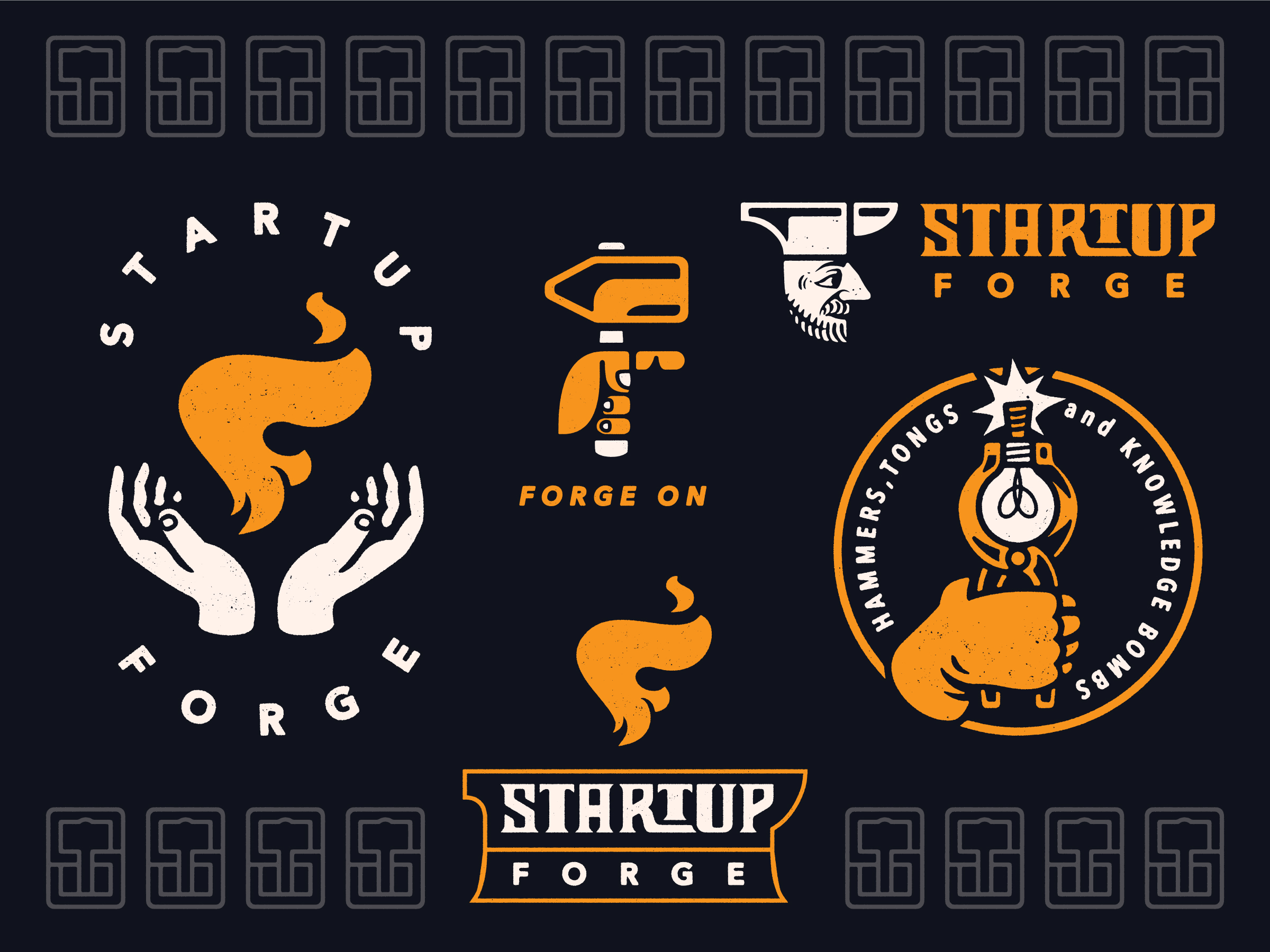
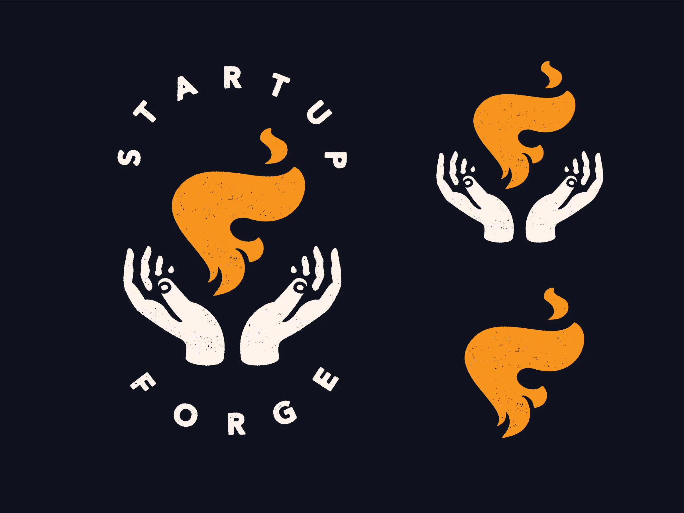
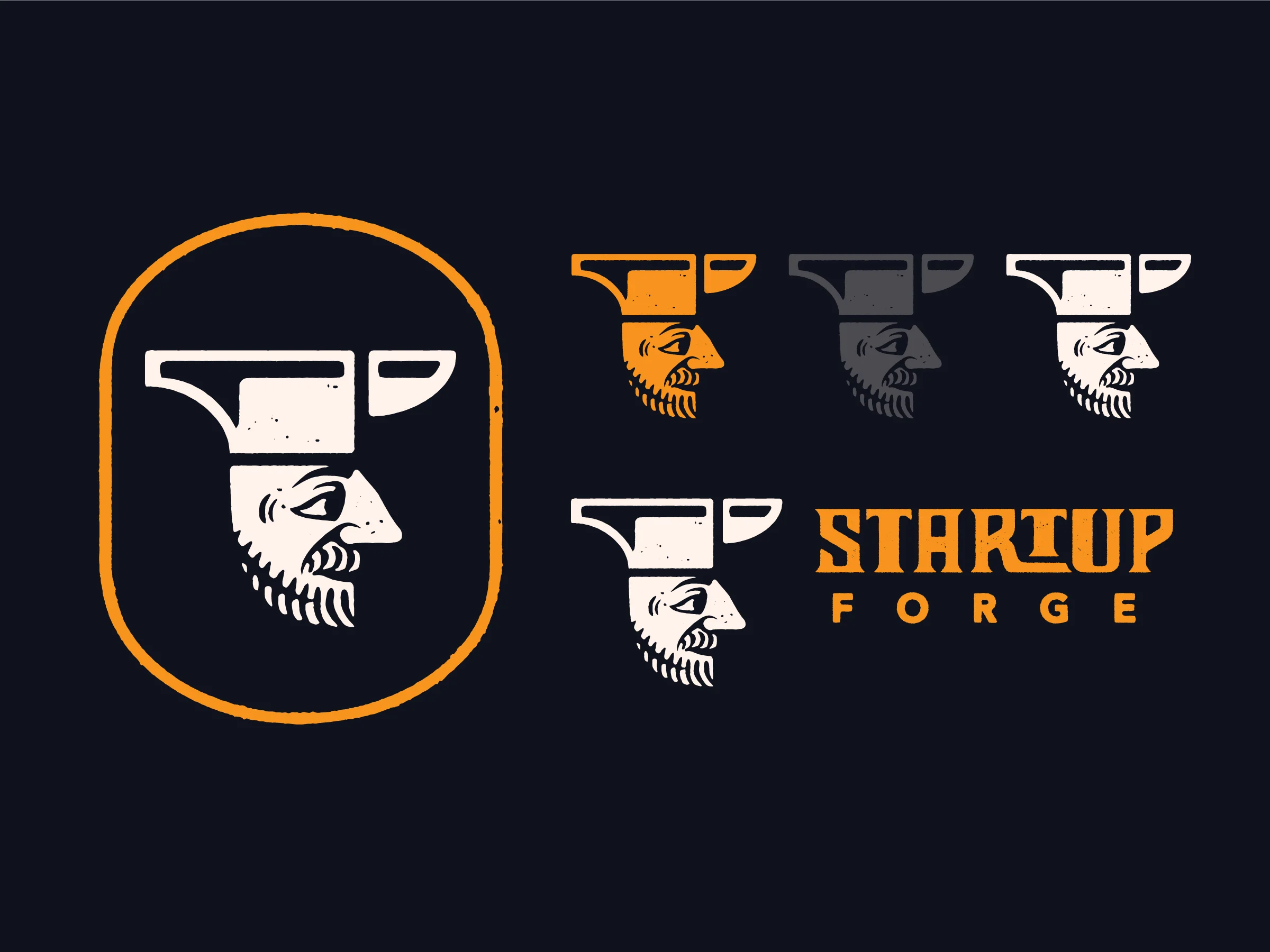
The Primary Logo displays Startup Forge’s hands-on approach to client relations with near magical results. The identity was built with flexibility in mind and can be utilized without text and even as simply the flame monogram.
⇩
A custom wordmark was developed for the brand to be especially effective in horizontal formats and can be used with or without additional graphic elements.
⇩

A drop cap “f” icon symbolizes the forward-thinking tempered vision that Startup Forge contributes.
⇩
A monogram icon serves as an identity for very small placements and also functions as a hand-wrought pattern to break up visual space when necessary.
⇩

Supporting badges and iconography not only highlight brand virtues and attributes, but also provide an easy area in which to further develop the brand’s visual vocabulary over time.
⇩